Redesigning impact reporting so Explorers feel supported, not burdened.
NatGeo needed a way to measure the impact they make to communicate with donors.
National Geographic Society funds researchers, storytellers, and conservationists — people they call Explorers — through grants that support environmental and sustainability projects worldwide. Donors like Rolex fund those grants. NGS's ability to secure continued funding depends on proving the impact those grants create.
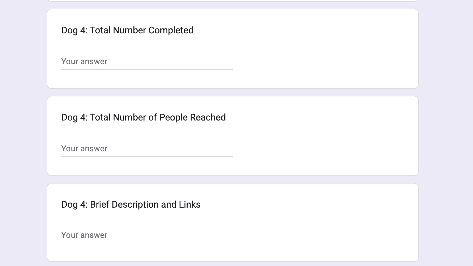
In 2025, the Strategic Insights team introduced a standardized post-grant reporting form: 13 impact indicators, each with multiple data fields, submitted through Salesforce. Mandatory for all grant recipients. The problem? Explorers weren't filling it out.
Except, despite the form being mandatory, lots of Explorers weren't filling it out.
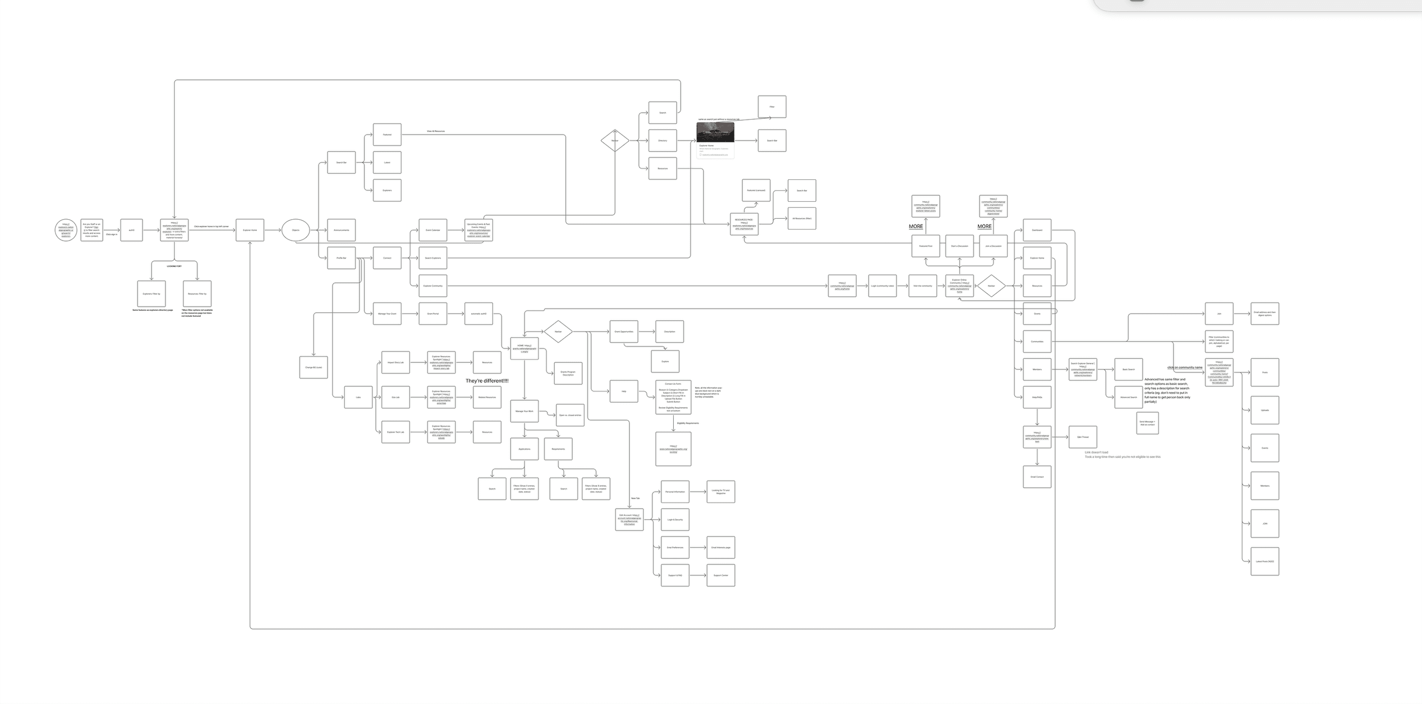
The Salesforce interface had no designed flows. Raw back-end, exposed directly to users. But fixing the interface alone wouldn't solve it.
current impact reporting form (1/2)
The goal? Reimagine how Explorers report their project impact through the platform they already use, the Explorer Home.
Even for the near-term prototype, they told me to push the boundaries and not go for something fully feasible. This was an exploration into "what could be" to rally important stakeholders.
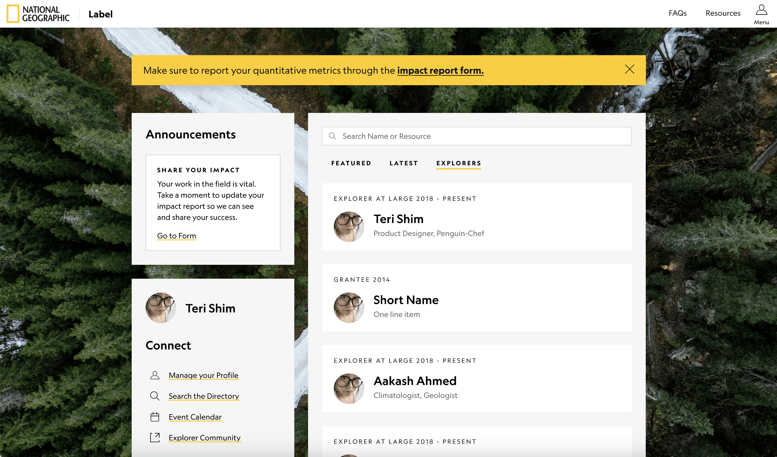
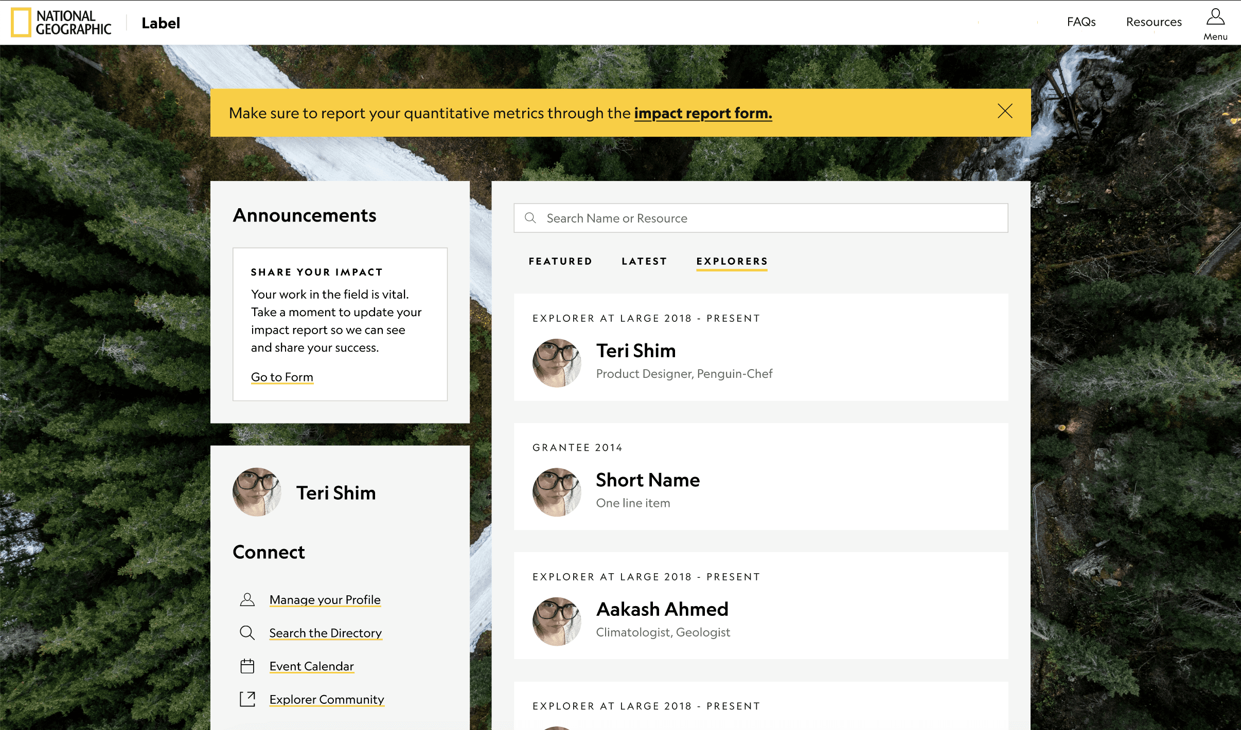
The internal NGS home for Explorers. Contains a directory, resources for their grant, and more.
Is it just the form being ugly that was causing issues? No. The Explorer's main complaints also clashed with what the business team needed.
Both sides were reasonable. The design problem was finding something that worked for both.
Current flow
01 — read all 13 indicators
02 — fill-ins, separate page
03 — submit form
new data available → repeat entire process from scratch
Proposed flow
01 — open database page, fill in indicators as applicable
02 — save and return to page when there's more updates
The number of indicators couldn't change. Reporting frequency couldn't change. The solution had to work within those boundaries.
What if we changed this flow by using a different mental model — like a database?
Wireframing revealed something the form format was hiding. The step-by-step wizard required Explorers to read through everything, switch between pages, and start over completely whenever new data came in. That's the right model for a one-time submission. It's the wrong model for data that evolves over the life of a grant.
The business team didn't need a form filled out once. They needed a database updated continuously.
The reframe: this isn't a form. It's an active record Explorers return to throughout their grant.
Changing the mental model changed everything downstream. Instead of complete and submit, the experience becomes open, add what you have, come back when there's more. Partial data stops feeling like a failure and starts feeling like how the thing is supposed to work.
Note: this was an assumption supported by secondary research. A cognitive walkthrough with Explorers would have validated it properly, but the timeline didn't allow for it.
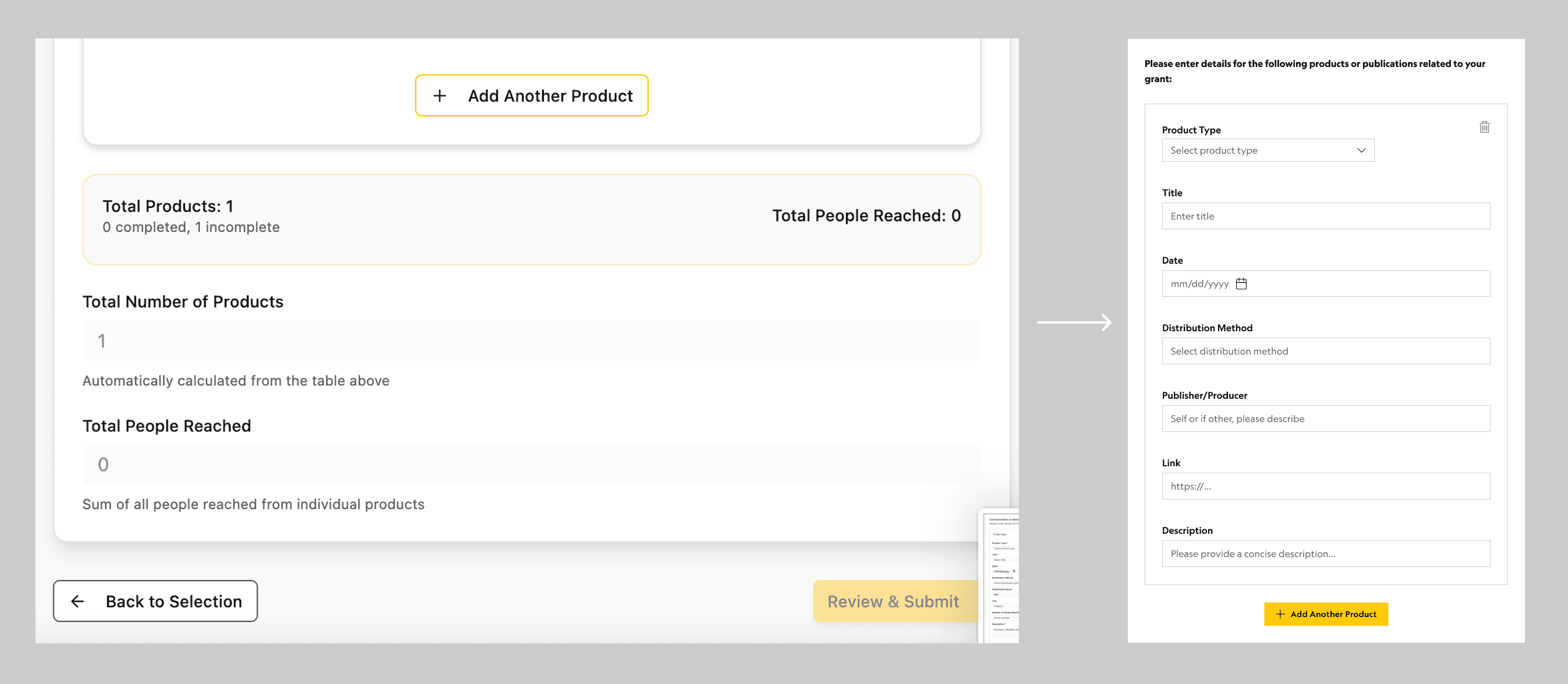
Integrating reporting into Explorer Home as a page Explorers can update at any time.
The near-term solution brings impact reporting into Explorer Home as a persistent page, not a form flow. Explorers already live in Explorer Home for grant resources and communications, so the reporting experience meets them where they are.
The near-term solution brings impact reporting into Explorer Home as a persistent database page, not a form.
Empty state: Explorers enter through an announcement or alert on their homepage.
Clicking the announcement navigates to the impact reporting page.
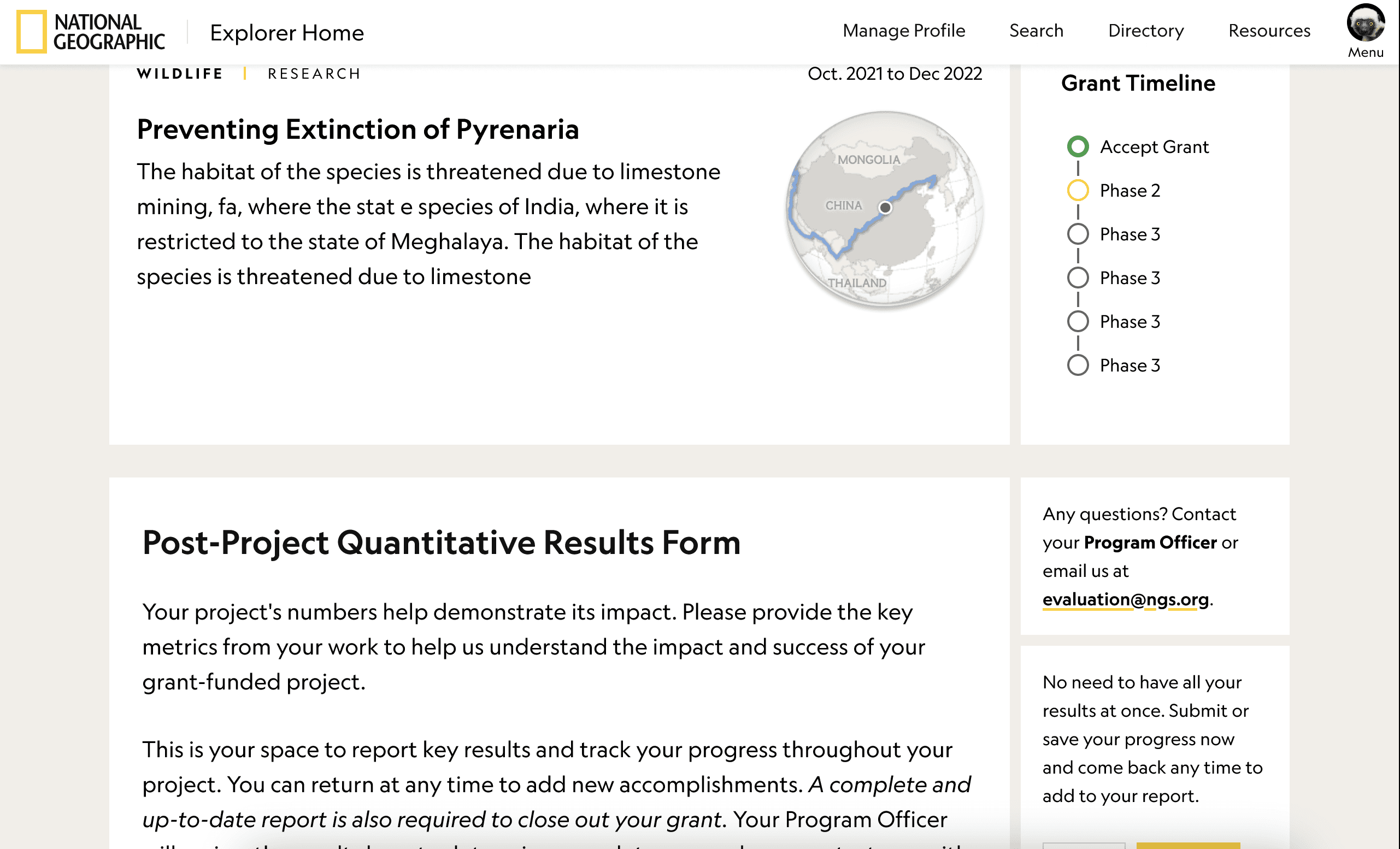
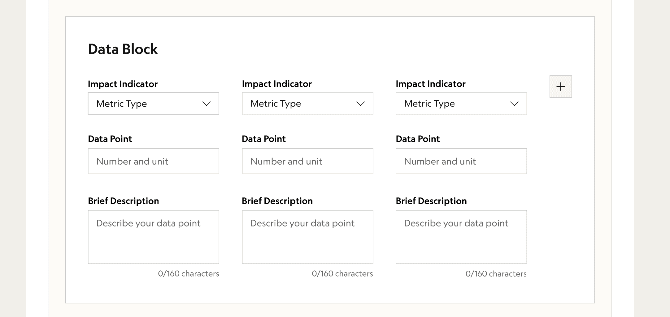
Grant details are embedded via Salesforce. All indicators live on one persistent page — expand any to fill in fields.
Save at any time. Return and update at any time — no resubmission required.
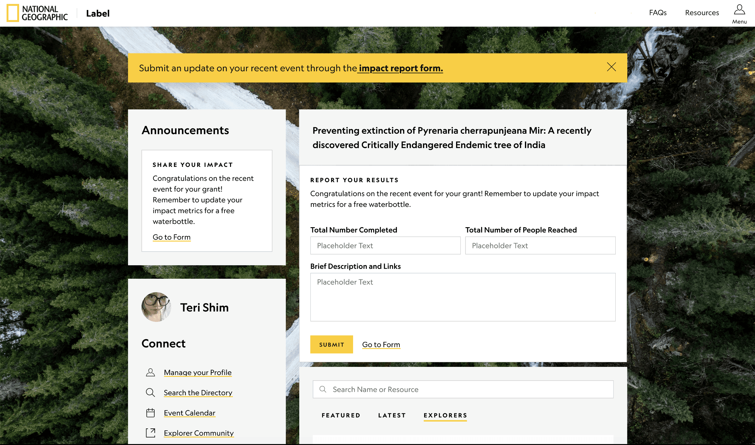
Update state: a milestone reminder surfaces an inline form directly on the homepage.
Explorers can submit a quick update without leaving their homepage, or navigate to the full reporting page.
Giving inherent value to updating your metrics by making them public-facing.
Each Explorer profile now includes a custom webpage with their grant information
The future concept makes impact data public-facing. Each Explorer gets a grant webpage that surfaces their metrics and connects them with the broader Explorer community. When work is visible to other Explorers and potential collaborators, there's inherent motivation to keep it current, beyond compliance.
With a website editor-style interface, Explorers can manage and add data to their webpage
The concept also introduced an AI writing assistant to help Explorers meet NatGeo's editorial standards in narrative reporting. A consistent pain point from the Explorer Home designer and PM: Explorers felt intimidated by the weight of the brand and second-guessed their own writing. The AI integration removes that friction.
Aligning design with business needs
Neither concept was scoped to ship immediately. The goal was to show stakeholders what the platform could become and make the case for investing in design.
Reducing brand pressure with AI support
An AI writing assistant helps Explorers meet NatGeo's editorial standards, removing the friction of brand pressure.
Presenting to stakeholders to inspire a future vision and explore the use of emerging tech in design ops.
The final designs were presented to the business team, the director of PMs, the design manager, and senior leadership. The presentation covered the full process: research, reframe, near-term design, and future vision, including a discussion of where Explorer Home's community features could go.
The project was scoped as a design exploration to inform future roadmap investment. Things don't always ship, but they can still shape what comes next.
stakeholder presentation
Loop in stakeholders regularly to maintain confidence and buy-in for your designs
Prototypes are incredibly effective in rallying stakeholders and pushing future visions
Understand the needs and frustrations of ALL of your stakeholders to create a comprehensive solution (business, design, end-user, development, management etc.)
Some other details that didn't make it into the case study...
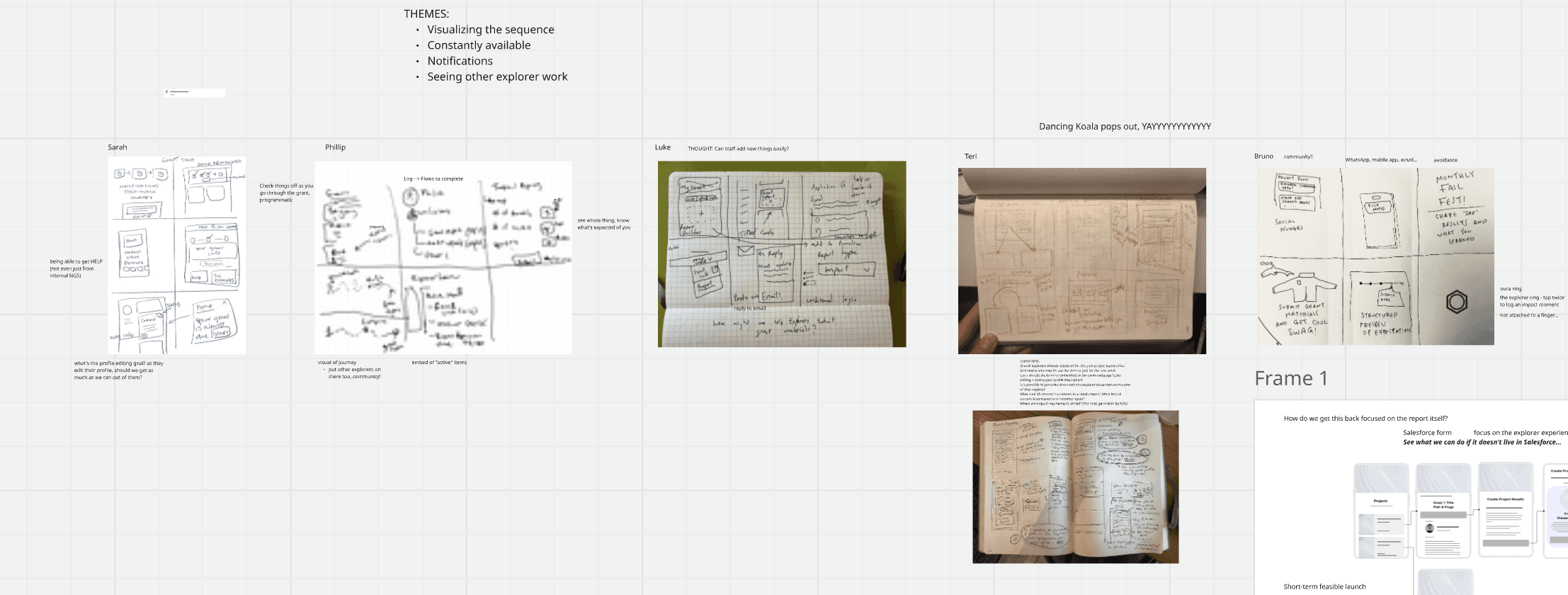
Ran ideation session with stakeholders around the question "How can we collect impact metrics?" to gather varying perspectives
Created new local components for the design system
Used Figma Make to ideate interaction patterns
Some other projects I worked on…
Designed and documented an internal AI tool to help non-technical writers build article webpages using design system components using Gemini prompt engineering, saving designers 5 hours per week.
Modeled the information architecture of the NGS grant recipient internal website and proposed changes to clarify content.
Ran unmoderated usability tests (Maze) to test how accessible, findable, communicative, and valuable trip details and ticket information on the new Museum website is for first-time, one-day visitors. Presented insights and recommendations to the design manager.